

How to Use the MACD to Determine Trend
Sponsored by the Dr. Stoxx Options Letter
MACD stands for “Moving Average Convergence Divergence,” a popular technical indicator used by traders and investors alike. The MACD is so named because it uses moving averages (two of them) to render a visual picture of times when those moving averages are either converging on each other or diverging from each other. The changing posture of these two moving averages relative to each other, either converging or diverging, gives the market technician information that can be used in rending judgments about where the security might be heading in the near future.
The MACD indicator is composed of three parts:
- An oscillator line that is made by taking the difference between two simple moving averages (most default MACD settings use the 12sma and the 26sma)
- A signal line that is made by taking an exponential moving average of the closing values of the oscillator line (most default MACD settings use a 9ema)
- An histogram which is plotted by measuring the difference between the oscillator line and the signal line; this histogram is plotted either above (for positive readings) or below (for negative readings) a 0-line
Here is a chart of the S&P500 with the MACD indicator below the price chart. In this chart will see the full configuration of the MACD indicator with all three of its parts intact:
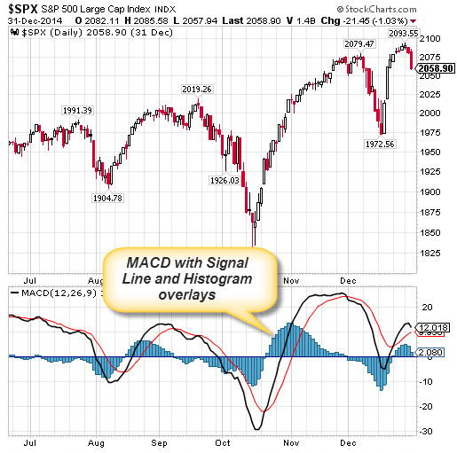
Chart 1: The S&P500 with the Full MACD Indicator
In chart 1 above we see the MACD with the Oscillator Line (black), the Signal Line (red), the 0-line, and the Histogram (blue). The settings are set at the default configuration of 12 and 26 (the periods of the two price sma’s) and 9 (the oscillator line ema). With this on the chart, the MACD can be used to identify ten different market indications:
1.A rising Oscillator Line indicates a price uptrend
2.A rising Oscillator Line above the Signal Line indicates a strong uptrend
3.A rising Oscillator Line above the 0-Line and Signal Line is the strongest uptrend
4.A crossover from below of the Oscillator and 0-Line indicates a good time to buy
5.A crossover from below of the Oscillator and Signal Lines indicates a better time to buy
6.A falling Oscillator Line indicates a price downtrend
7.A falling Oscillator Line below the Signal Line indicates a strong downtrend
8.A rising Oscillator Line above the 0-Line and Signal Line is the strongest downtrend
9.A crossover from above of the Oscillator and 0-Line indicates a good time to sell
10.A crossover from above of the Oscillator and Signal Lines indicates a better time to sell
The simplest use of the MACD is to note bullish and bearish periods in a price chart whenever the Oscillator Line is above (bullish) or below (bearish) the 0-Line (#4 and #9 above). Within the bullish periods you would want to buy the security, and within the bearish periods, you would want to stay out of or short the security.
In chart 2 below, I have highlighted the bullish and bearish periods based only the whether the Oscillator Line is above or below the 0-Line:
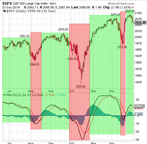
Chart 2: Bullish and Bearish Periods Using the MACD 0-Line
You’ll see in Chart 2 that this very simple trend identification works effectively to highlight the areas of strongest trend momentum in both up and down trends. While this is a good approach, it is not precise enough for trading purposes. Since the MACD using moving averages, it tends to lag. This is fine for catching the major trends, but like all trend following indicators, it will not work well in choppier markets. There is a solution, however. Take a look at Chart 3 below:
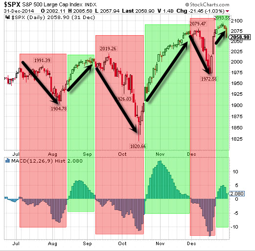
Chart 4: Bullish and Bearish Periods Using the MACD Signal Line
In Chart 4, I have removed the MACD Oscillator and Signal Lines and am using only the MACD Histogram. Since the Histogram prints bars above the 0-Line whenever the Oscillator Line is above the Signal Line, and below the 0-Line when that is reversed, we only need the Histogram to mark our bullish and bearish periods using the Signal Line (#5 and #10 above). In this way, we have made the MACD more precise by demarcating our bullish and bearish periods using the more responsive Signal Line crossovers. This gets us into changes in trend more quickly.
In Chart 3 above, you will see that this use of the MACD would have enabled us to take some nice profits on both the long and short sides of the market by simply following the mechanical signals generated by the MACD Histogram.
TC
Recent free content from Dr. Thomas Carr
-
{[comment.author.username]} {[comment.author.username]} — Marketfy Staff — Maven — Member


- 1 Campus Martius, Suite #200Detroit, MI 48226
- +1 877 440 9464